Brand identity · November 2025
Lumara
CONSTRUCTION PROCESS
{{ counterText }}
02 · Brief
The brief
A fictional brand identity, built from scratch. The guideline itself is assembled in Adobe InDesign, Illustrator, and Photoshop.
Product
Spray-on solar coating for existing surfaces
Deliverable
Full brand guideline: design mark, lockup, color, type, clearance
Window
November 25–30, 2025
03 · Logo
First sketch + generations
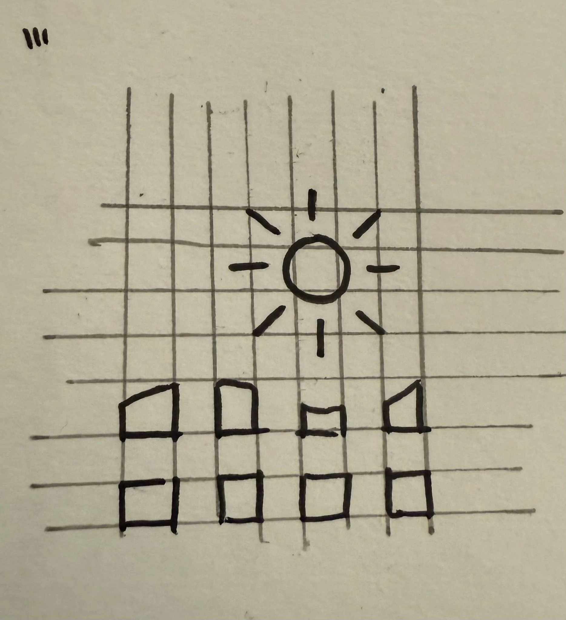
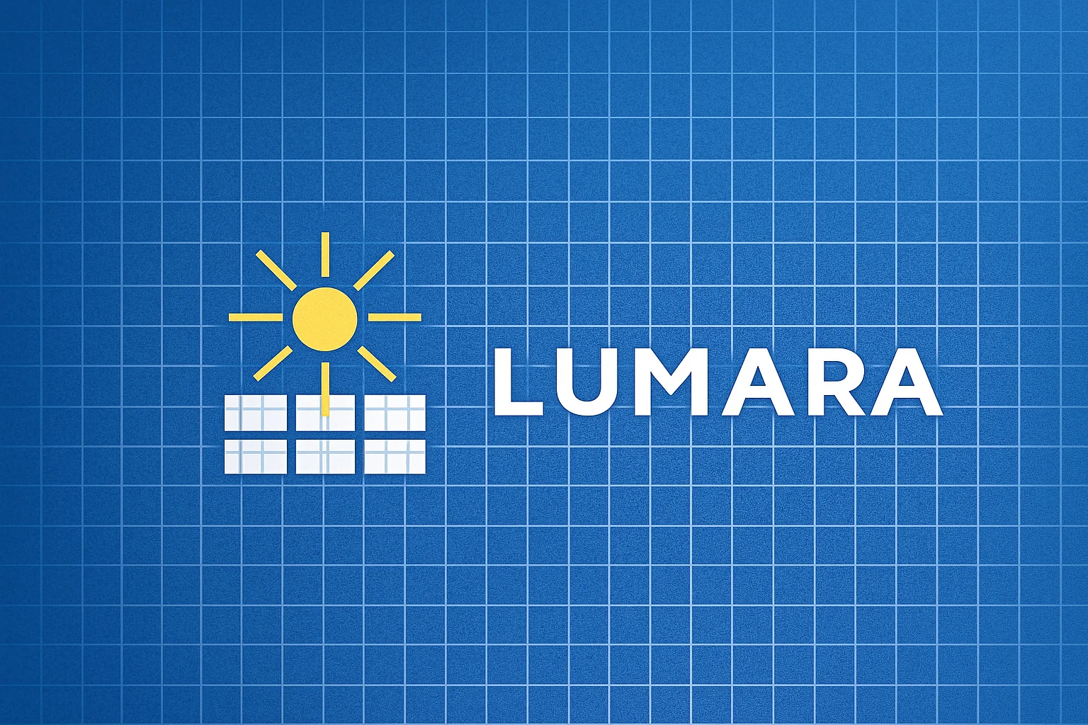
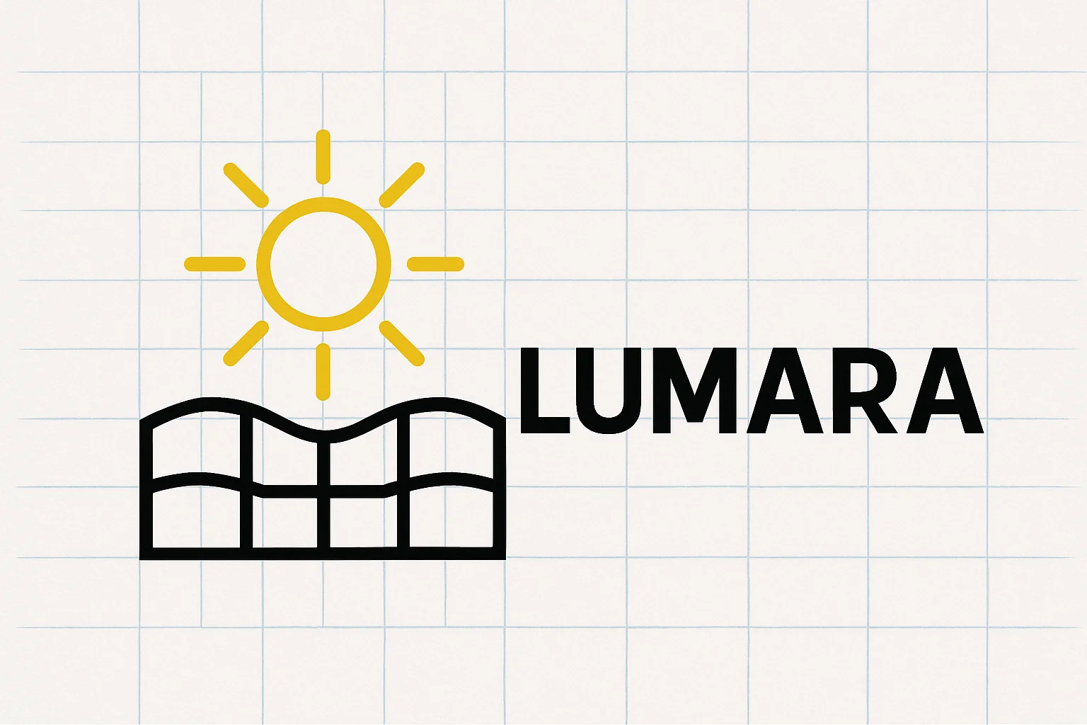
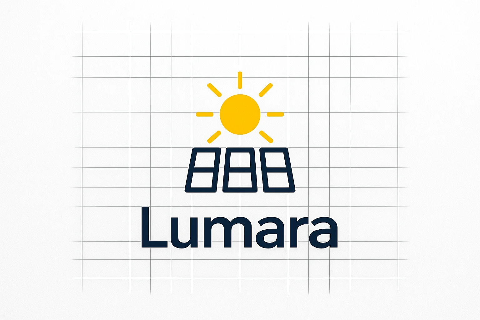
I knew that for the logo I wanted to base the design around a strong sense of a grid and order. After my third sketch attempt I handed it off to AI to see if it could give me any other interesting starting points.
04 · Logo
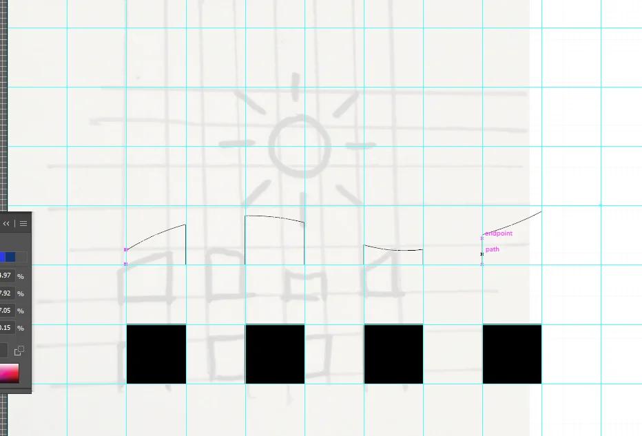
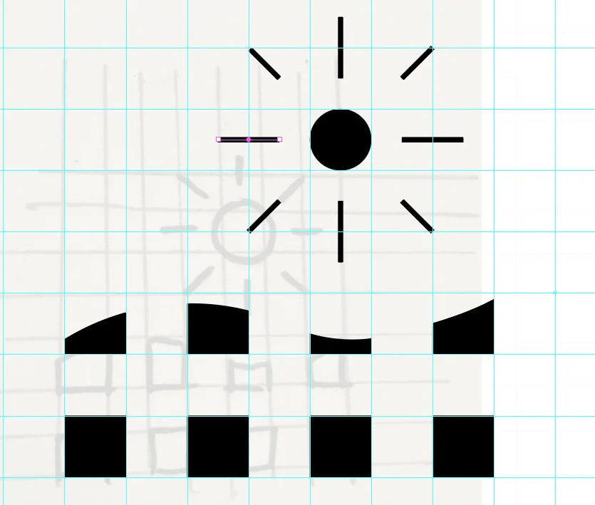
Into Illustrator
Recreating the logo sketch in Illustrator didn't yield great results.
05 · Logo
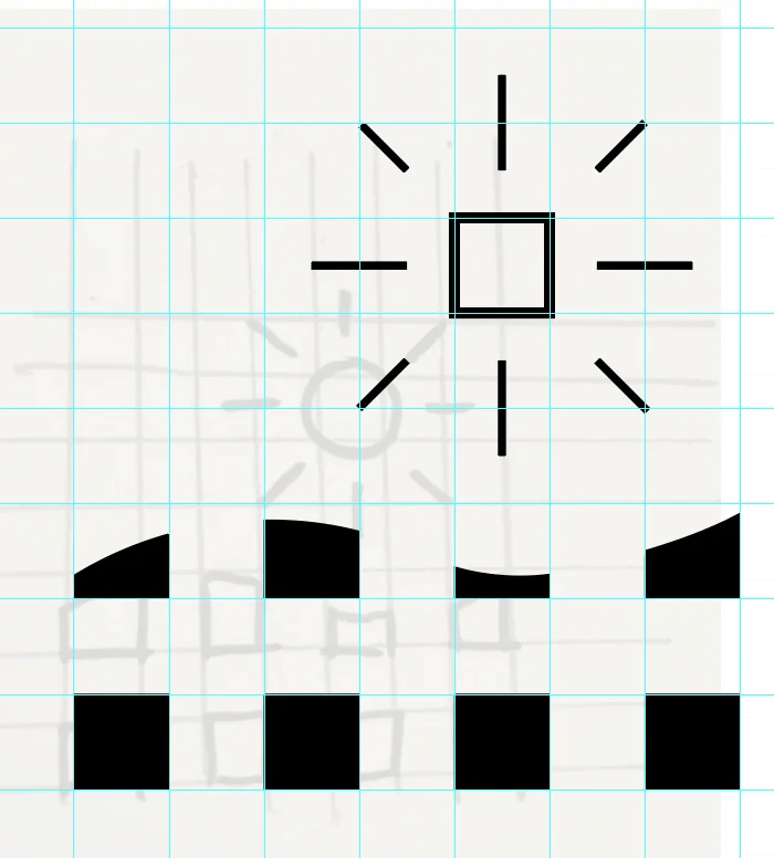
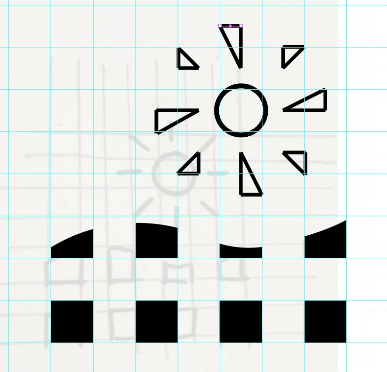
Version 2, then blocky type
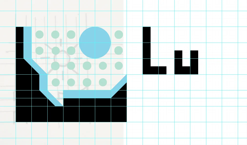
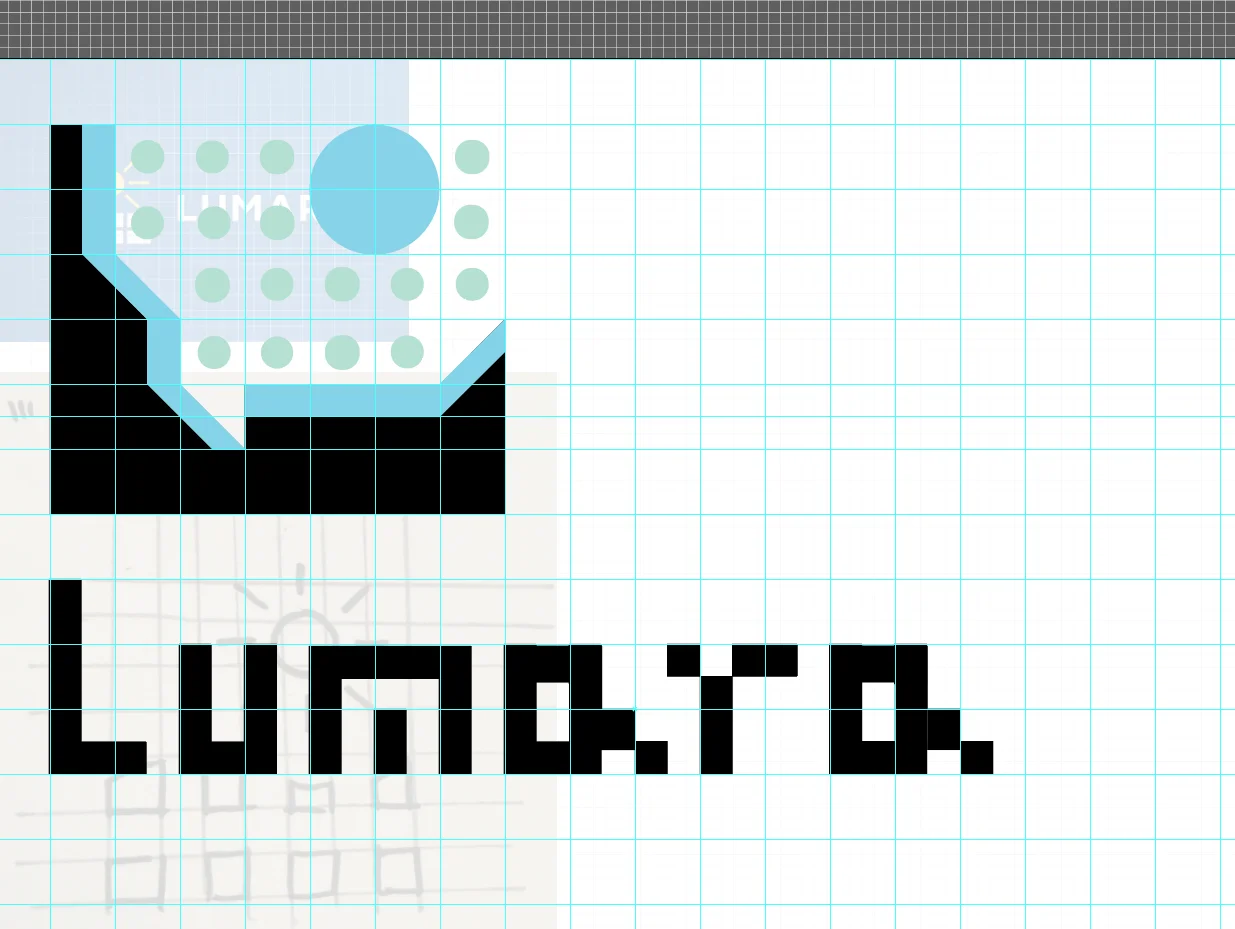
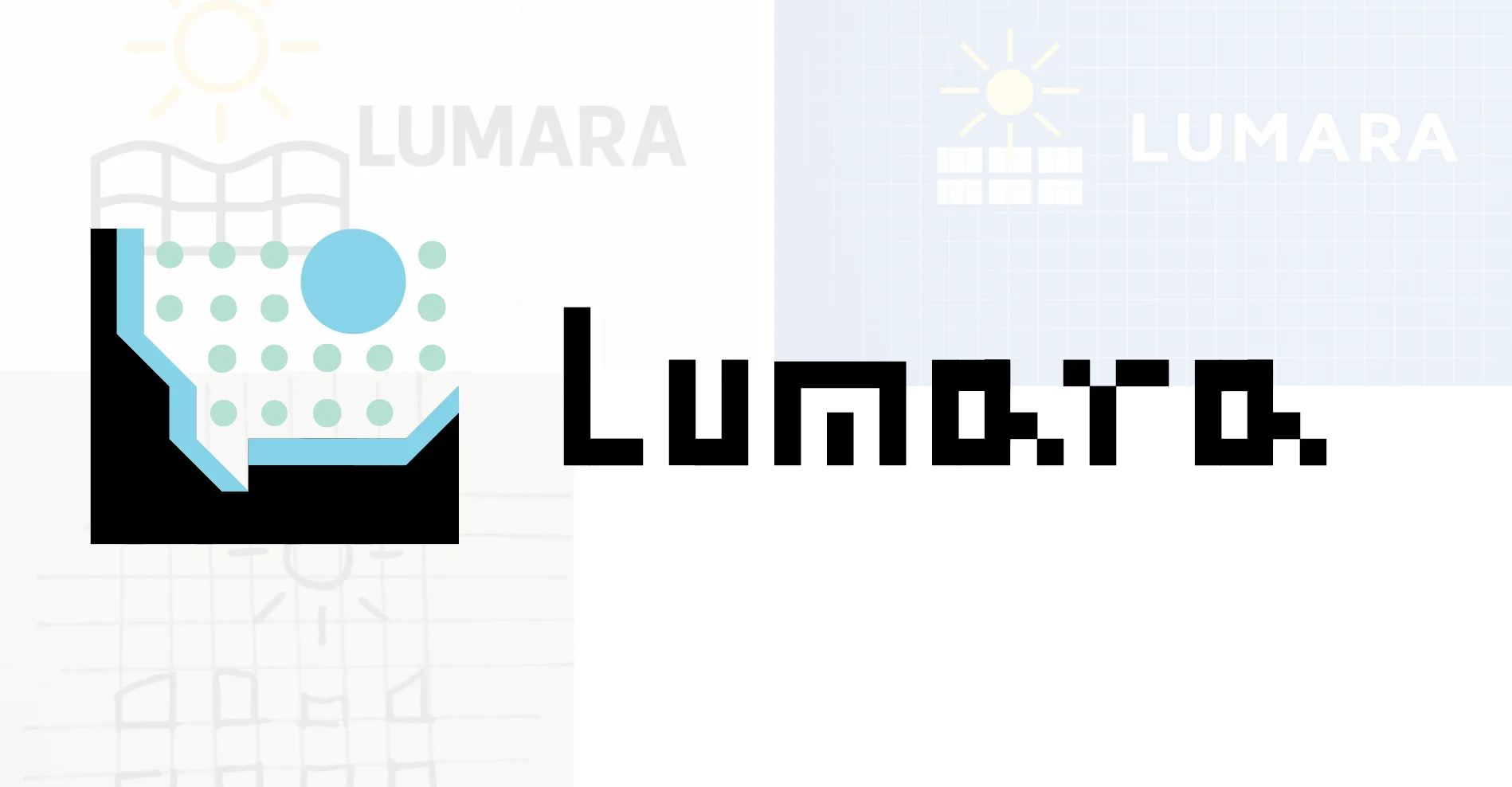
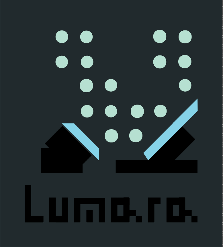
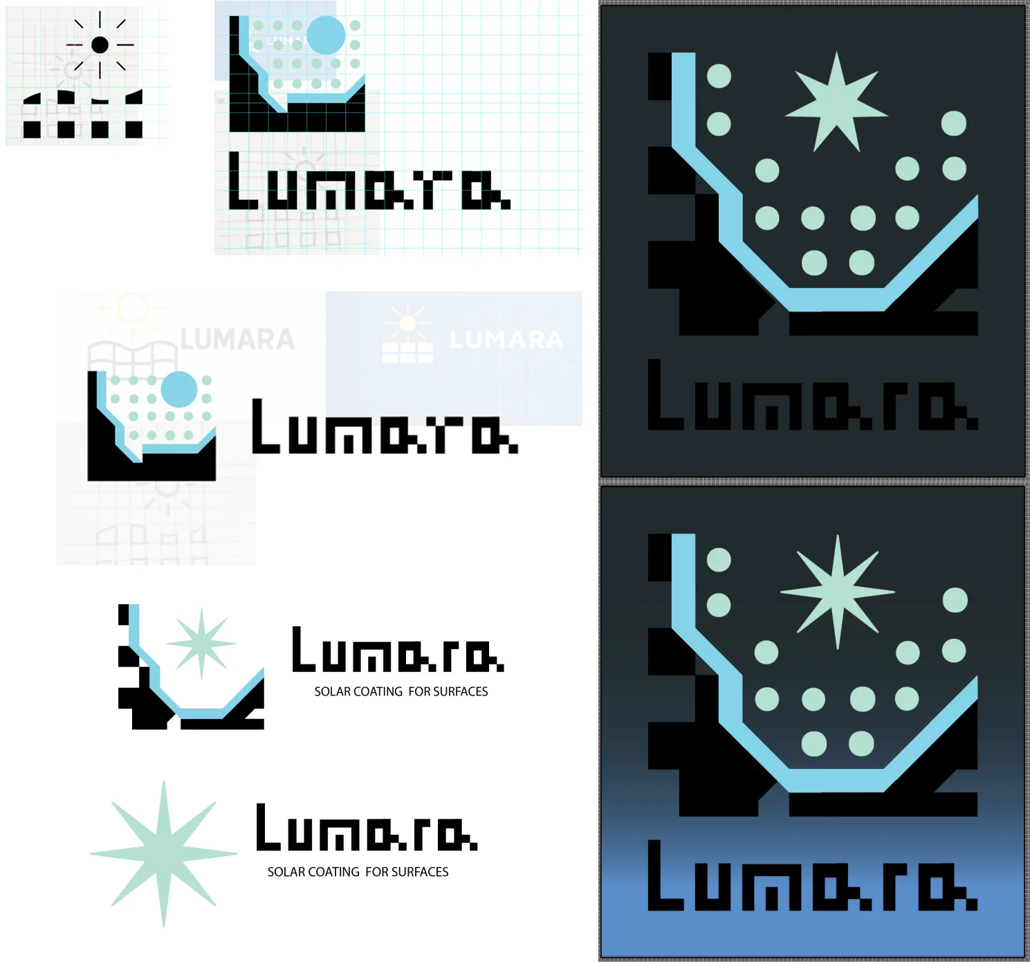
For the second version I wanted to give the idea of industrial architecture that was collecting packets of energy from the sun, while sticking to my blocky grid. Logo text was cut from the same grid.
06 · Logo
Further exploration
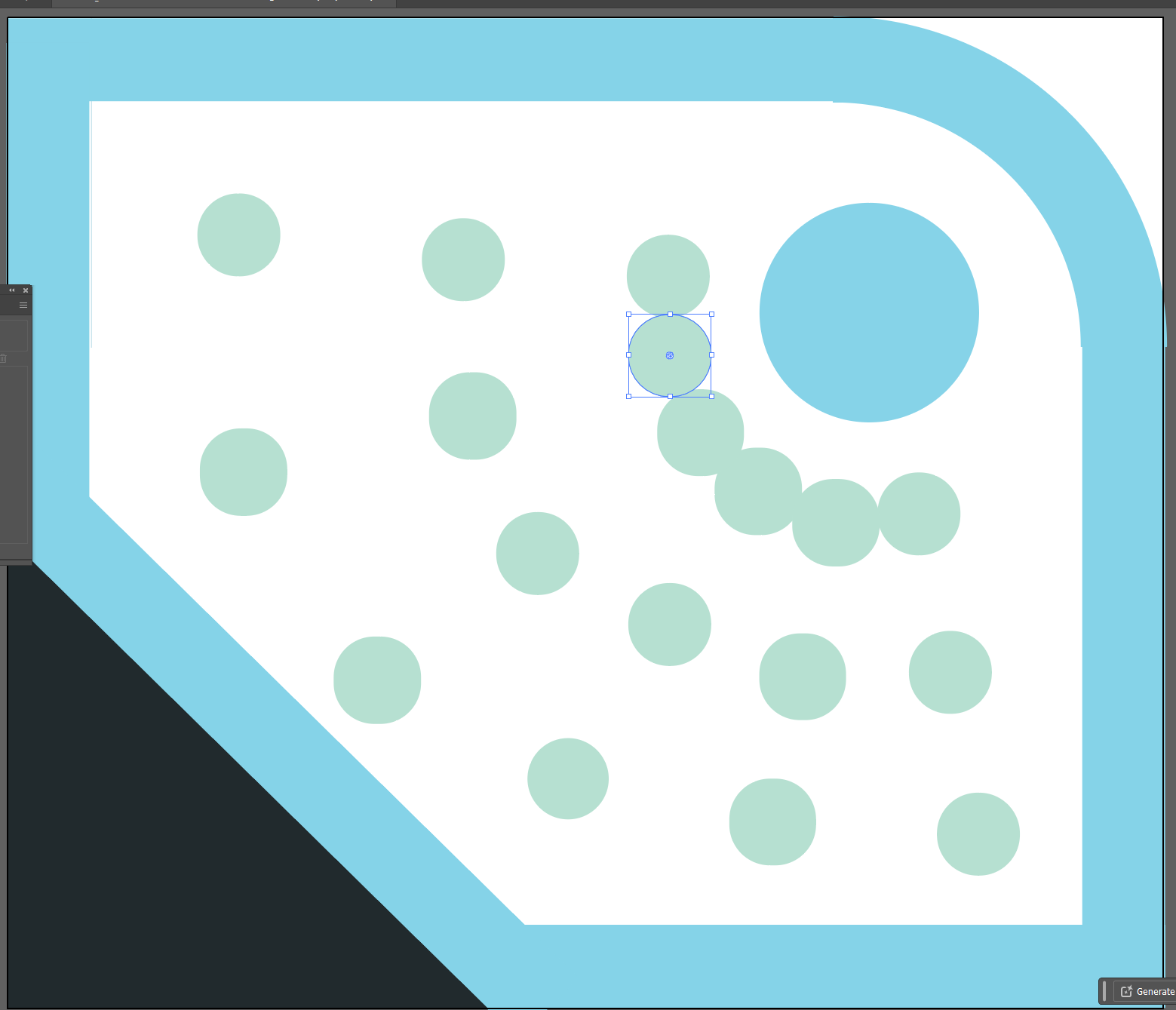
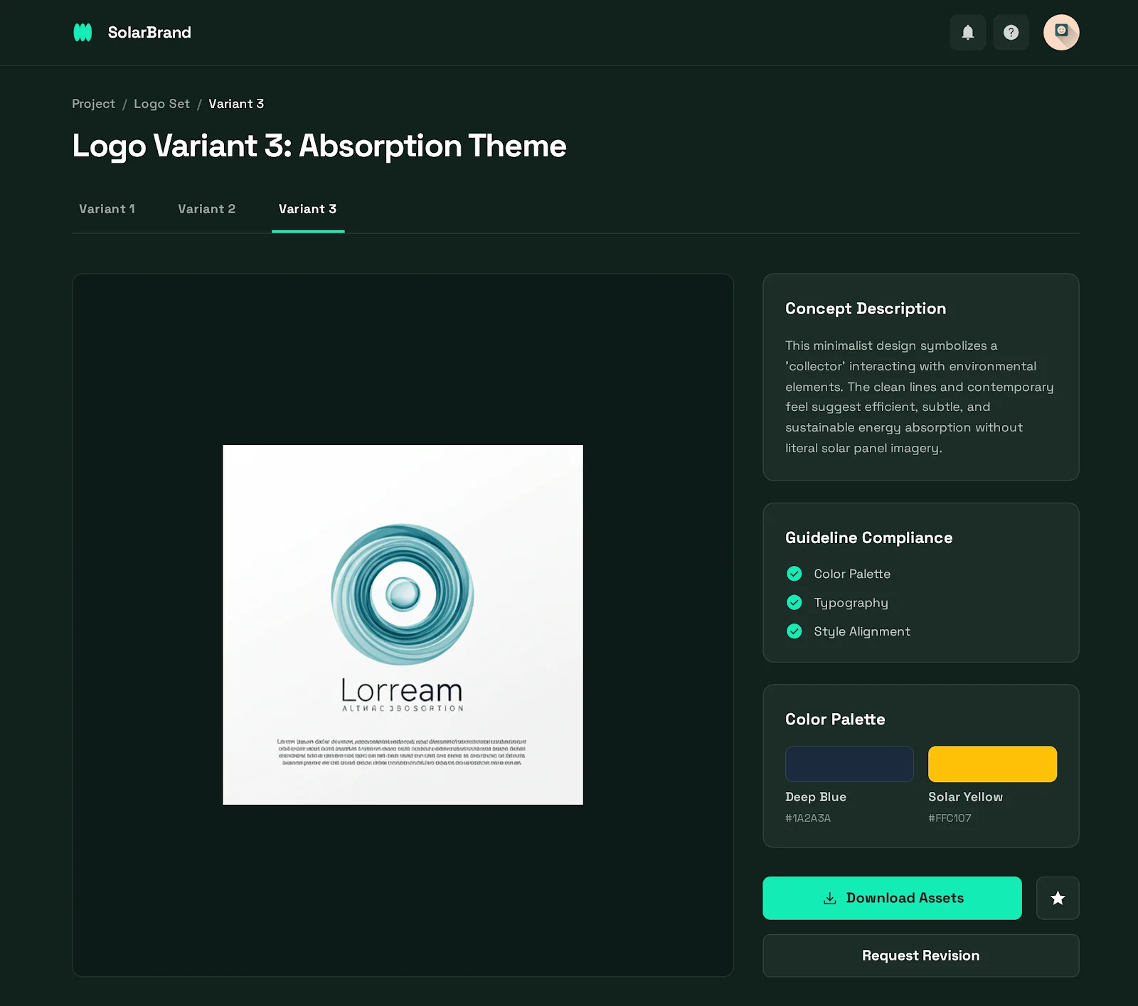
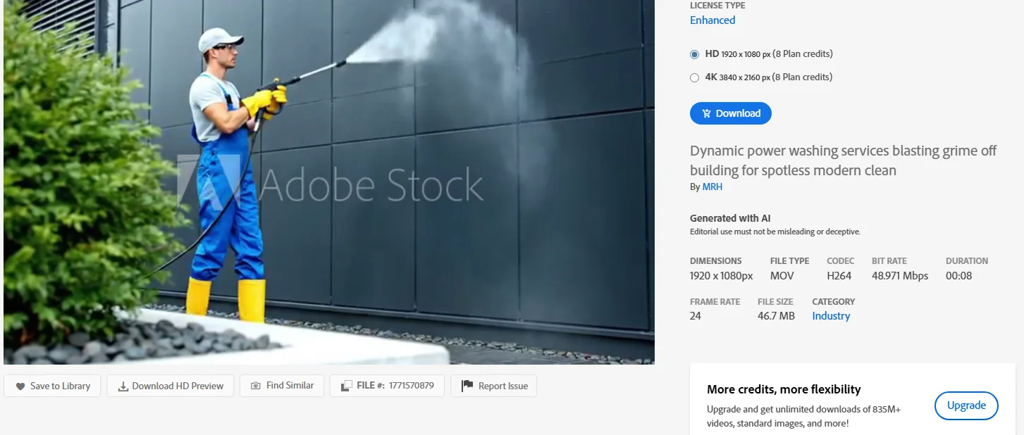
Went back to AI and asked for some more generations, while also going to Adobe Stock to browse some of the assets that I might use in the final brand guideline.

07 · Identity
The point of differentiation
We are the only company that turns everyday surfaces into sources of energy.
If it can be sprayed on anything, that has to come first in everything: the logo, the marketing, all of it.
08 · Logo
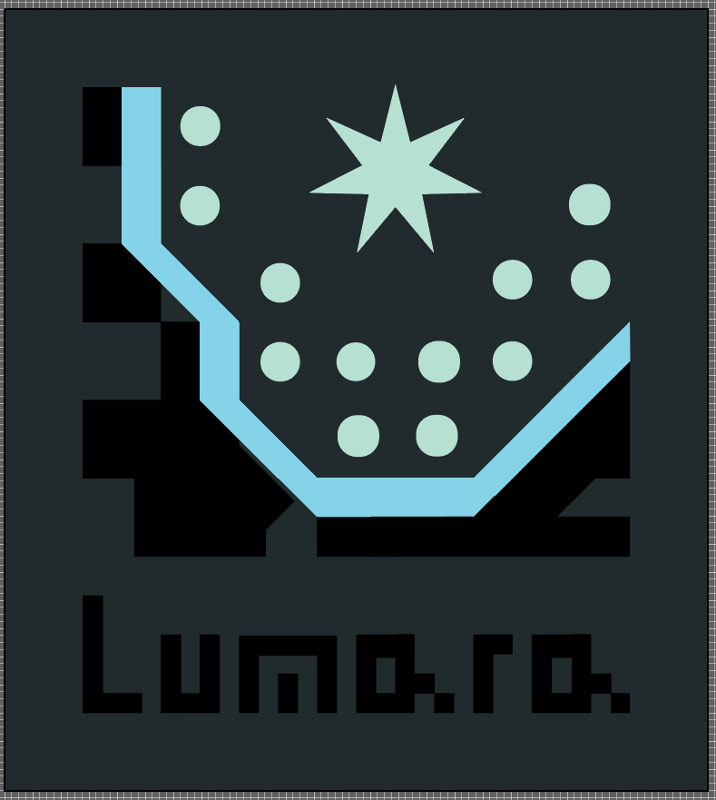
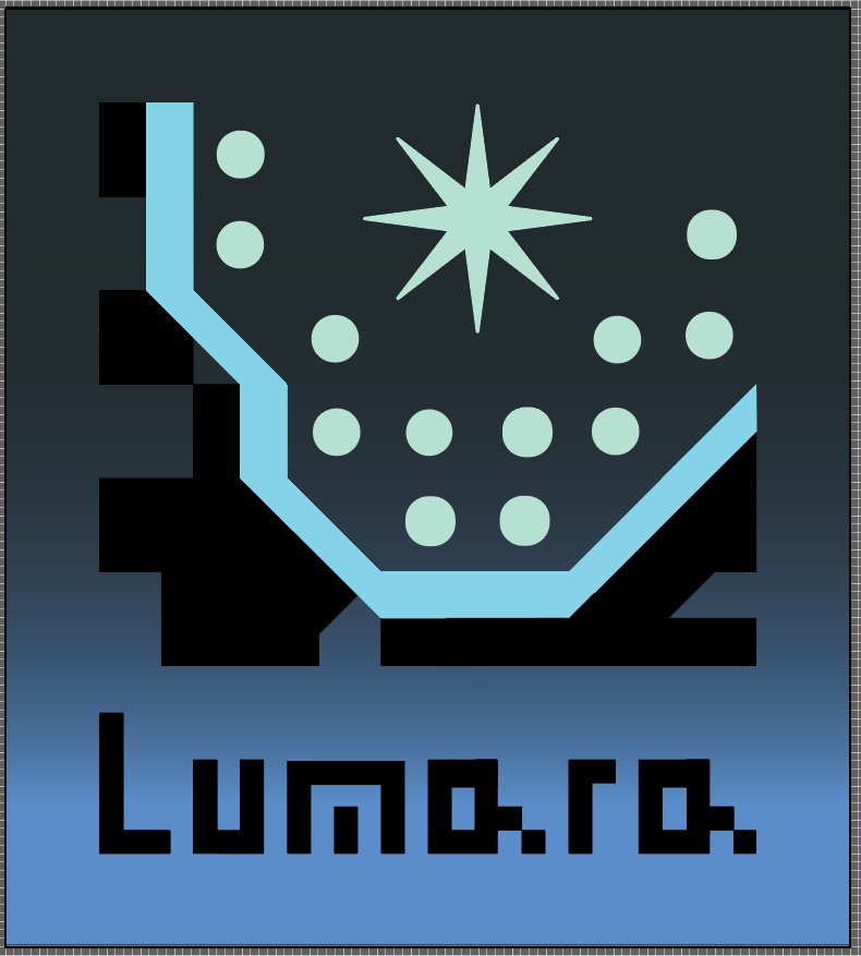
Star and coating
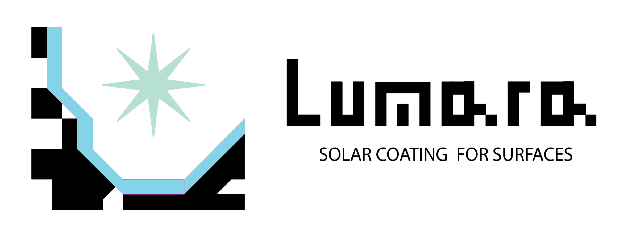
This version of the logo I liked up close, but at a distance I couldn't tell what it was. Although I liked the direction, I had to eventually abandon this route for looking too much like just a confusing piece of tech.
09 · Logo
The simplicity test
If just one part of the logo looks better than the whole logo, then you've probably done something wrong. Like the Nike swoosh, we want to be recognizable and simple, not just techy.
10 · Logo
Day 2
Did I have a logo I could have used? Yes.
Is that why I do this? No.
11 · Logo
Drawn with a finger, rebuilt at 32×32
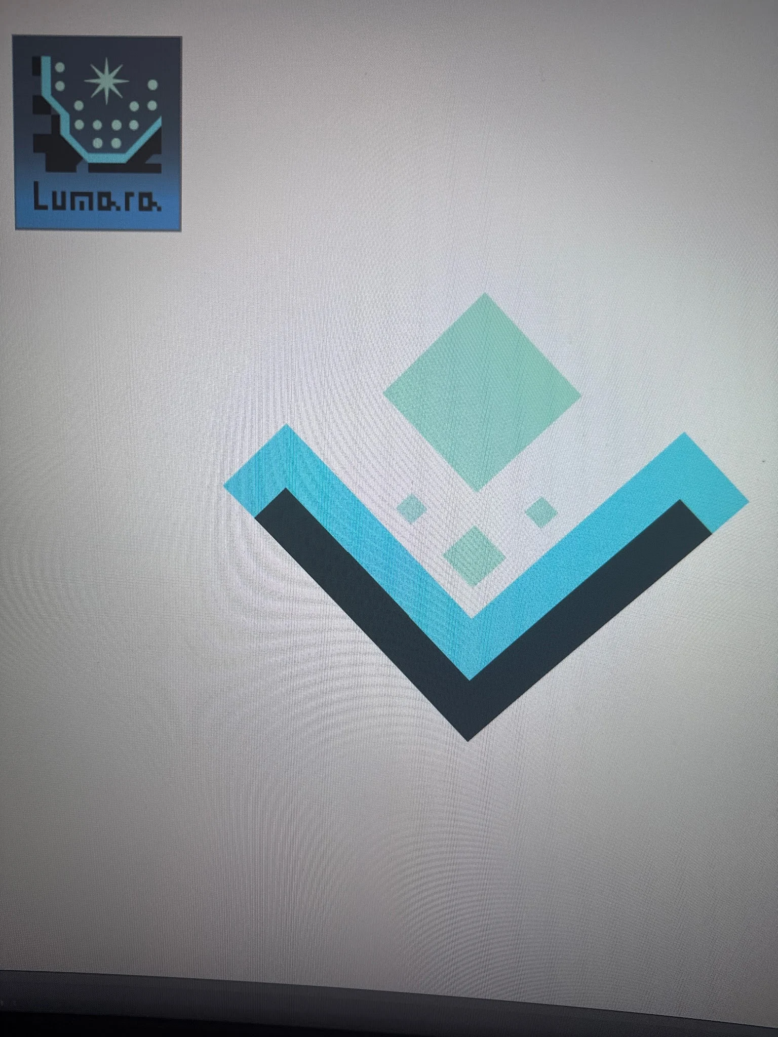
"It should be simple enough to where you can draw it on the car window with your finger during a long car ride."
I went back to the drawing board on the iPad: sun, surface, solar coating, transfer of energy. The logo only had to communicate those things, and I should be able to communicate all of that in my 32×32 grid.



12 · Logo
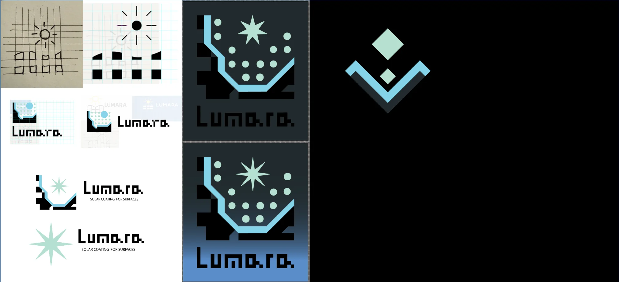
The journey so far
The 32×32 grid became the foundation. Thinking in pixels: a square icon should ideally stay readable inside a 64×64px square, such as a browser tab icon.
13 · Identity
Lumara is not trying to look friendly.
Lumara is trying to look inevitable.
14 · Logo
After two days, I can breathe
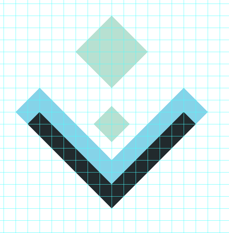
The smaller square is sized and placed exactly. The whole shape is a symmetrical diamond.

15 · Identity
What we are, what we are not
Answered before opening a color picker. Color has to carry the identity too.
We are definitely not
Old school
Common solar
Unintelligent
Saving the planet, kumbaya
We are
Future tech
Exciting
Sustainable
Making existing industry more profitable
16 · Color
Three roles
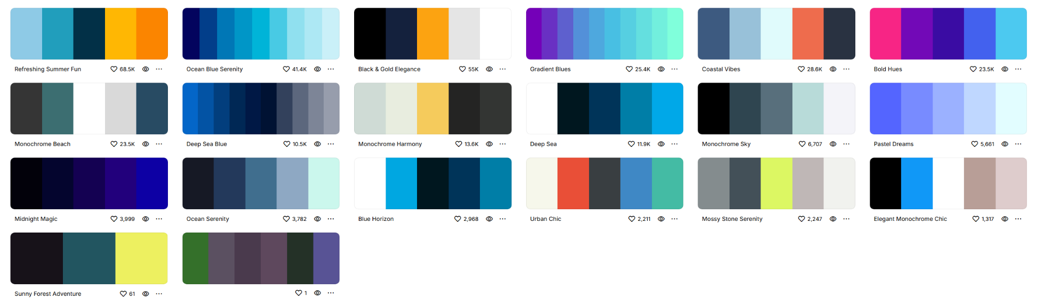
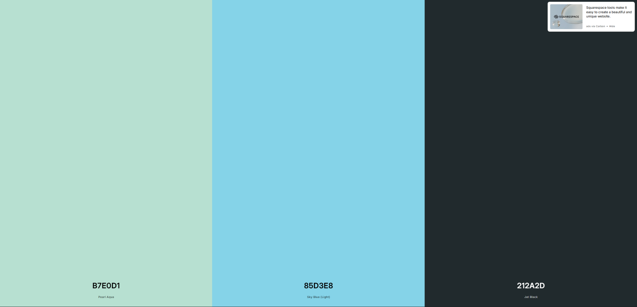
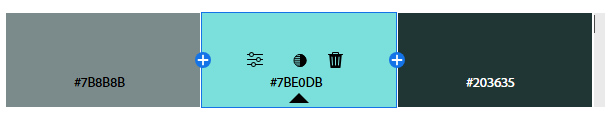
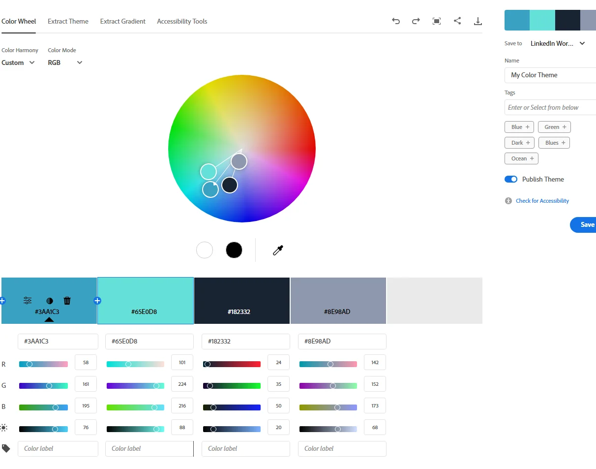
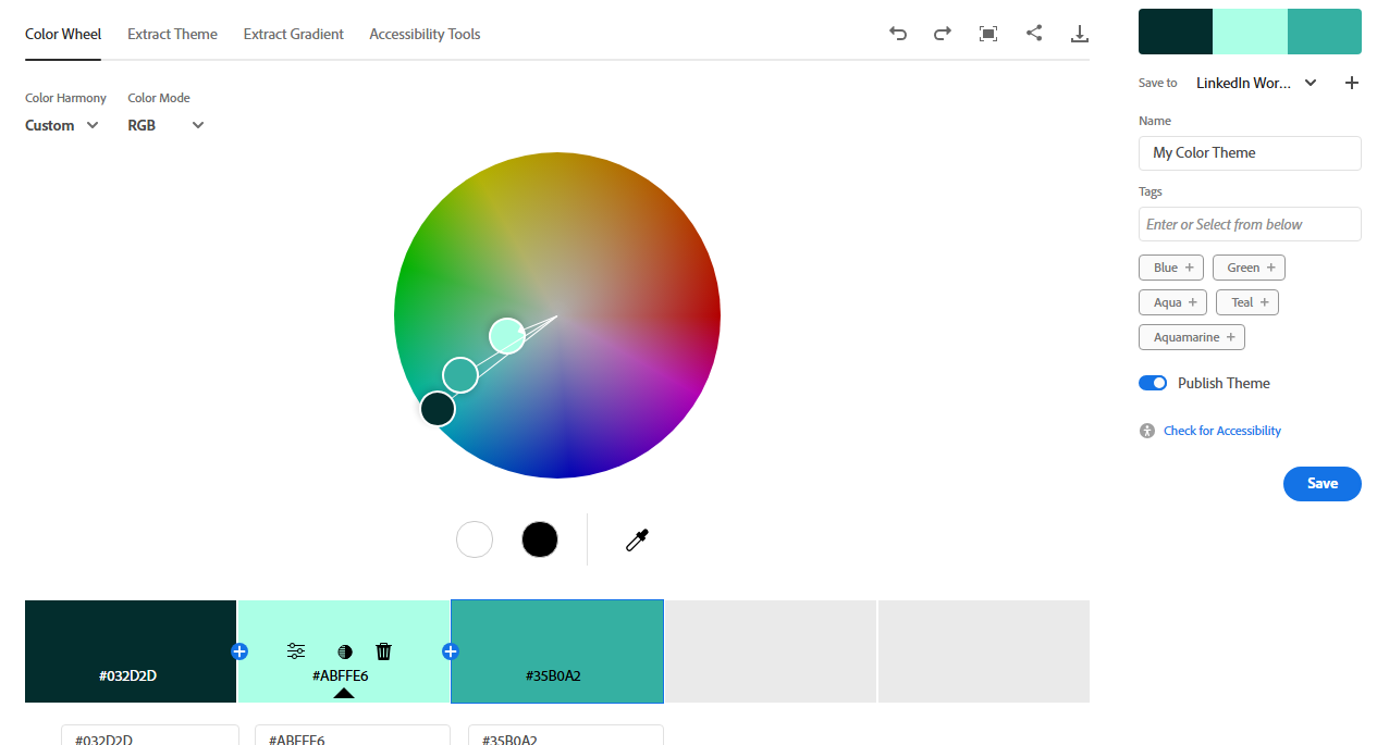
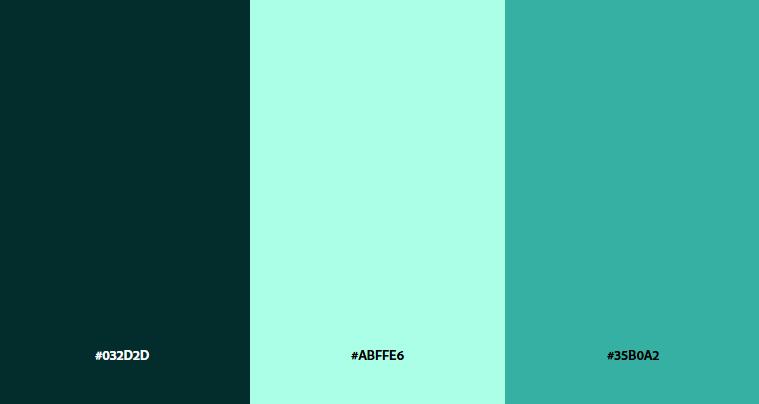
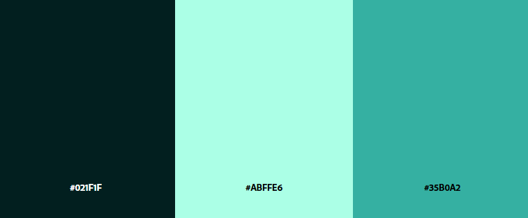
Was searching for a 3-color palette that read like a 2-color composition. The blue ("energy coat") and green ("nature, sun") would serve as the primary and secondary.








17 · Color
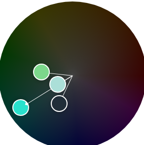
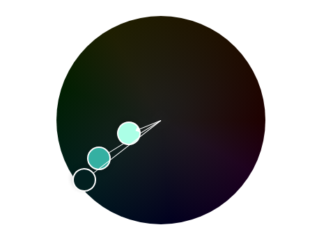
Working the wheel
18 · Color
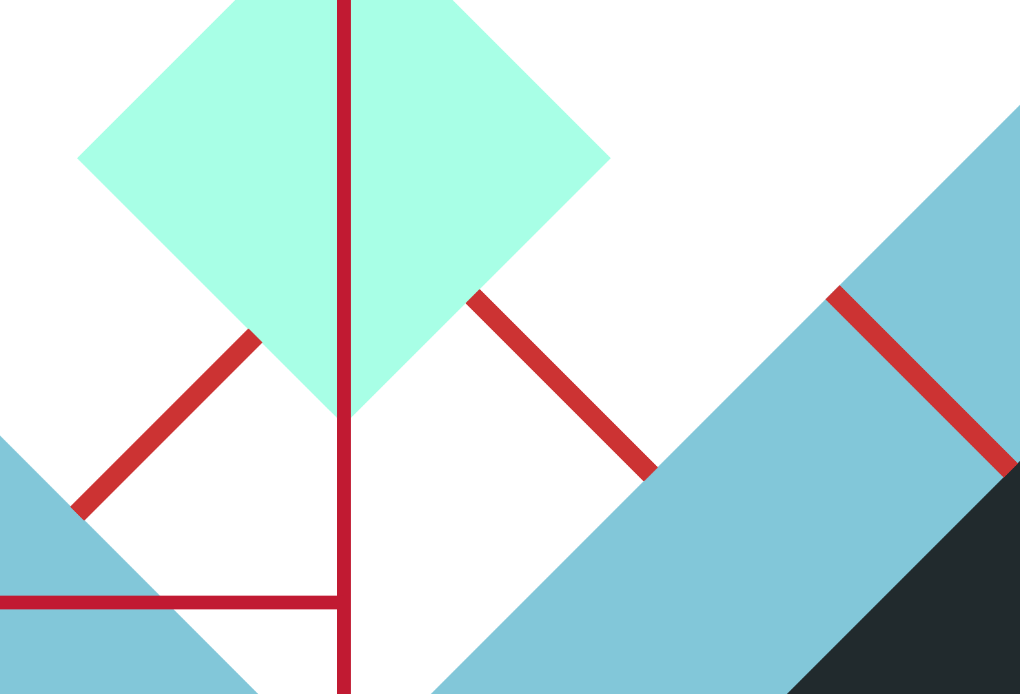
Tested on the mark
Applied and compared, I preferred the original scheme. The first pick was the better pick, and saturating the coat blue restored the hierarchy.





19 · Lockup
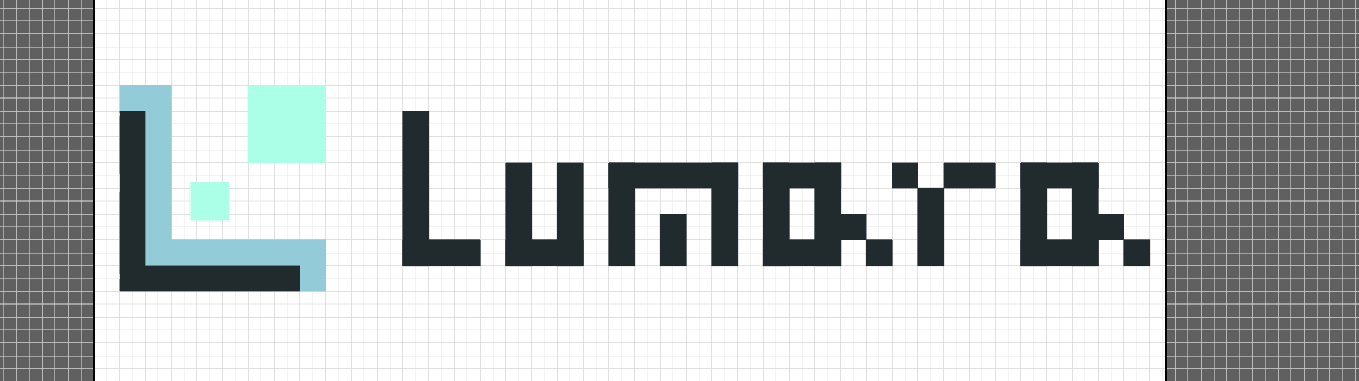
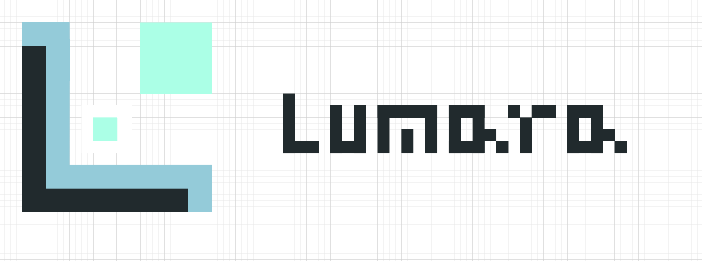
L is for Lumara
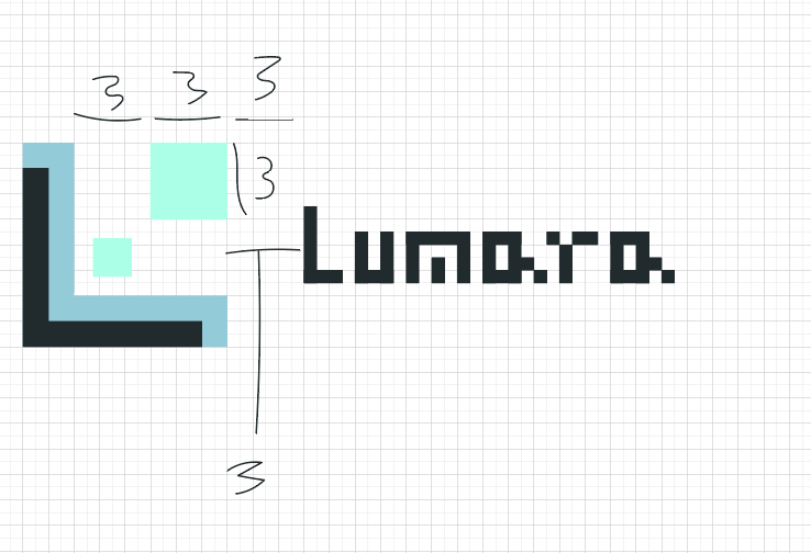
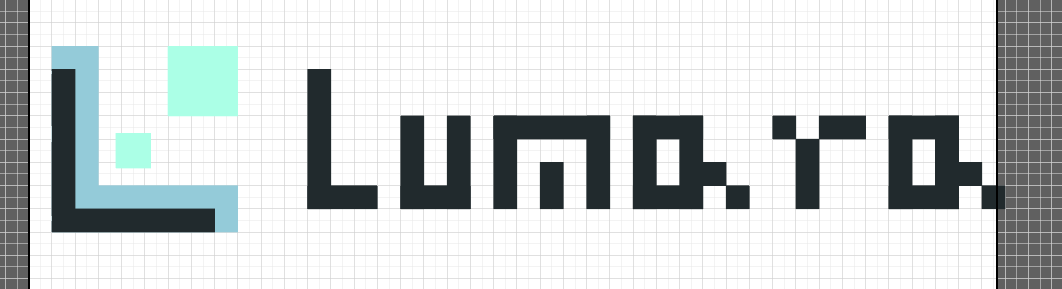
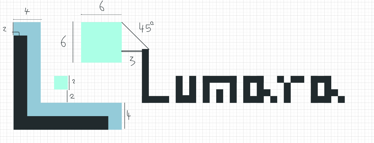
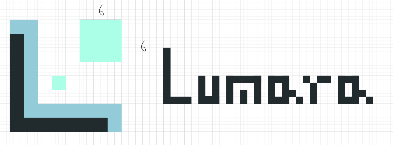
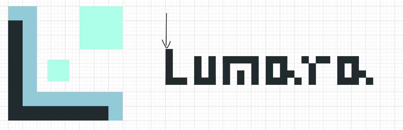
If it still communicates sideways it might be the better lockup. The inner square also runs slightly large, an artifact of building at 45 degrees.
20 · Lockup
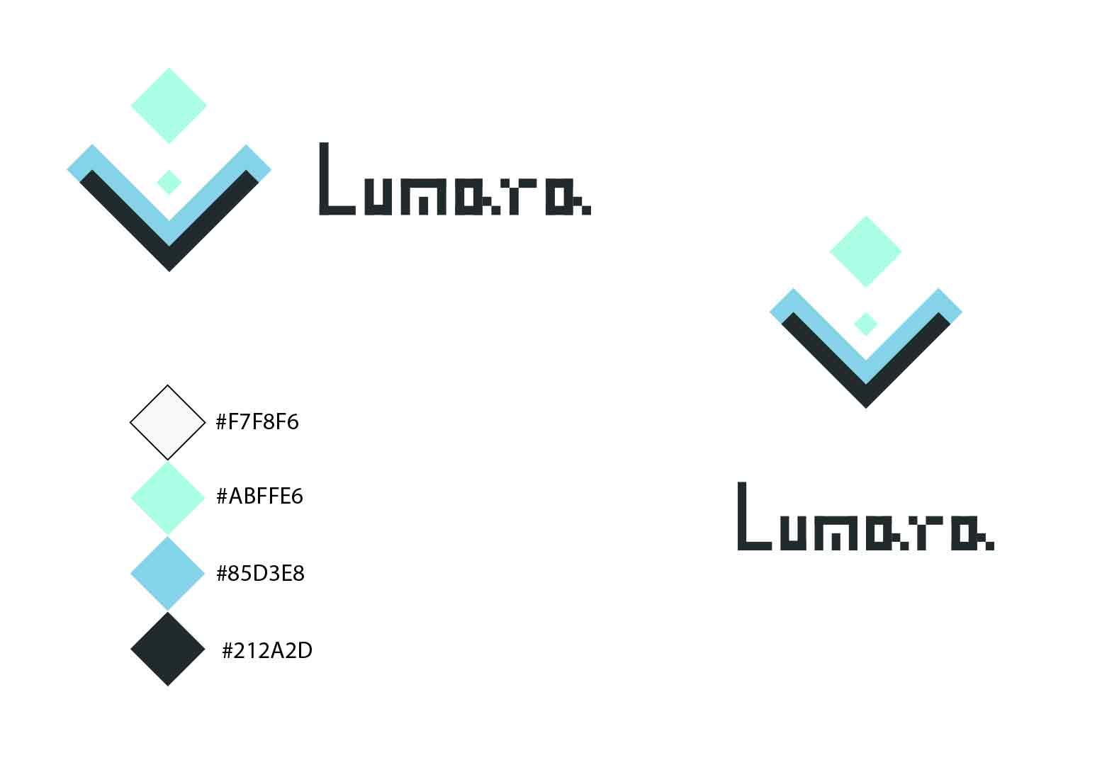
Upright wins
Decided at the last moment. Upright feels more like a brand emblem.

21 · Type
Typeface
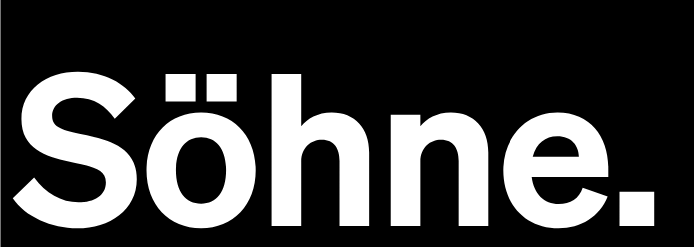
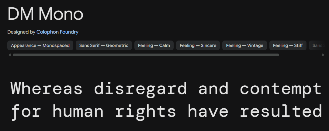
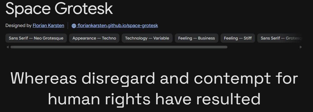
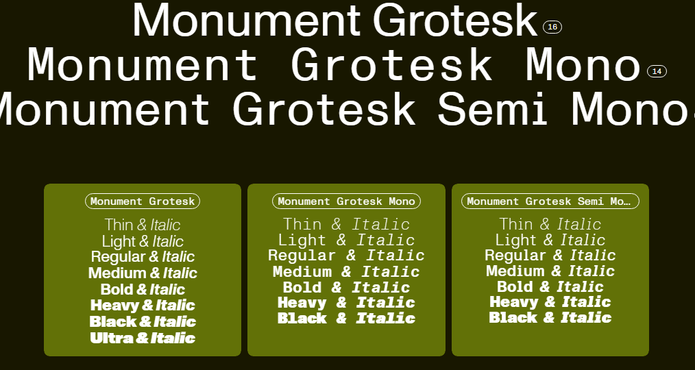
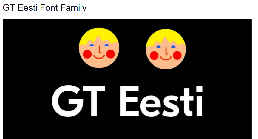
Something that says tech and plays into the blockiness already set up. Test Söhne takes primary headings.

22 · Guideline
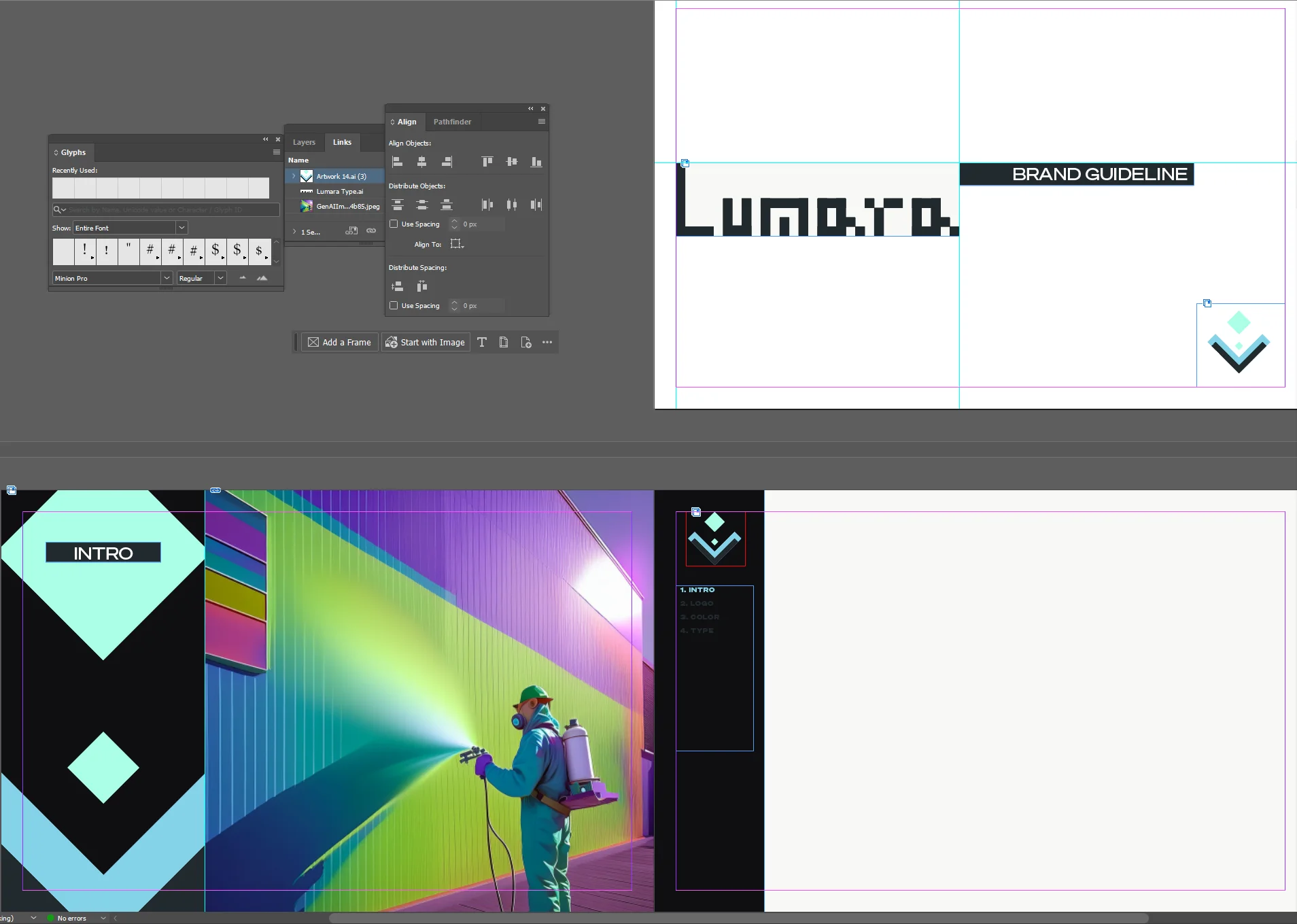
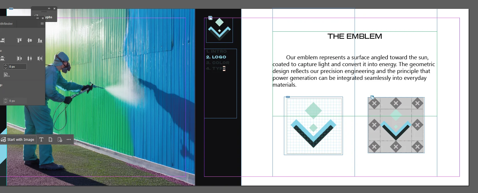
Spreads and export
23 · End
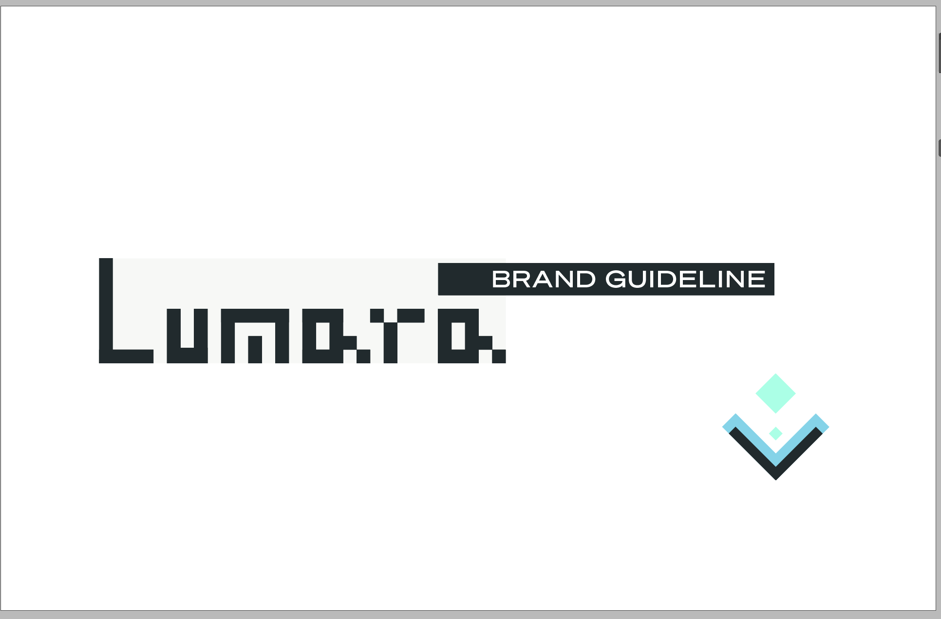
Final logo
Alexander Blair · November 2025